How To Enable Core Block Features In ACF Blocks
Take advantage of the core block editor color picker, add margin and padding, or set custom borders on your ACF block.
Create a more consistent editing experience
I was really excited when Elliot Codon launched ACF blocks back in 2019. However, I was concerned with the difference in the editing experience when commingling ACF and Core blocks. I saw this in two ways:
- The way you edit your content is different.
Rich editing UIs for Core blocks and custom fields for ACF bocks. - The UI for sidebar controls were completely different.
ACF and Core blocks had very different UIs for controls. From color pickers to radio input – everything was different.
ACF blocks, and the block editor as a whole, have come a long way since then. We’re getting closer to providing a better, more consistent editing experience. In the next lesson I’ll cover <InnerBlocks> and how we can insert Core blocks into a parent ACF block as children. This will help with addressing point #1 above, but in this lesson I’ll cover how to enable Core sidebar controls in your ACF block.
Block Controls
We’ll be enabling controls within our block’s block.json file. Feel free to use the table of contents to the right to jump around and learn about a block control that interests you.
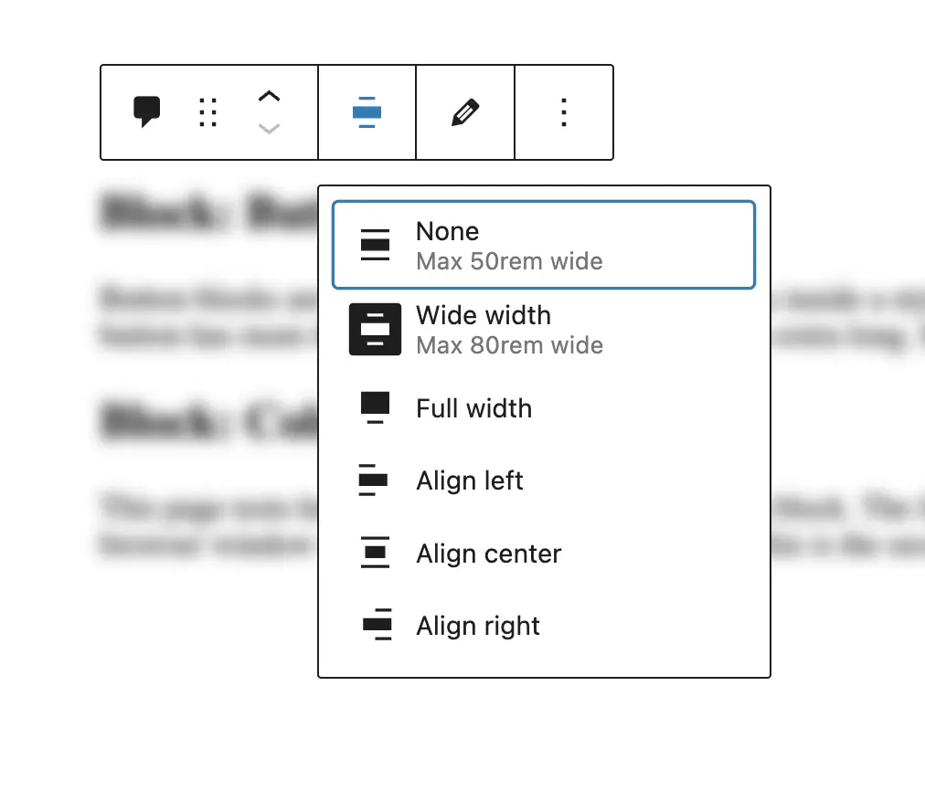
Alignment
Alignment lets you change the width of your block or center it. Alignment should come enabled by default, but we’ll set the pattern of defining our block’s capabilities here.
{
    "name": "posts-loop",
    "title": "Posts Loop Block",
    ...
    "supports": {
        "align": true
    }
}
If you’re using theme.json, we define our content width and our wide width under the settings object:
"settings": {
    "layout": {
        "contentSize": "50rem",
        "wideSize": "80rem"
    }
}
Both ACF and Core blocks use these alignment sizes and have corresponding classnames. If you set your block to the wide alignment, the classname would be alignwide while the full width alignment would be alignfull.
Here’s how we access our block’s alignment and apply the appropriate class name. From your block’s controller: block.php
<?php
    // Block classes
    $class_name = 'my-first-block';
    if( !empty($block['className']) ) {
        $class_name .= ' ' . $block['className'];
    }

    // Block alignment
    if( !empty($block['align']) ) {
        $class_name .= ' align' . $block['align'];
    }

    /**
     * Pass the block data into the template part
     */
    get_template_part(
        'blocks/my-block/template',
        null,
        array(
            'block'      => $block,
            'is_preview' => $is_preview,
            'post_id'    => $post_id,

            'data'       => $data,
            'class_name' => $class_name,
            'block_id'   => $block_id,
        )
    );
And in your render template: template.php
<?php
    // The block ID
    $block_id = $args['block_id'];

    // The block class names
    $class_name = $args['class_name'];
?>
<div id="<?= $block_id; ?>" class="<?= $class_name; ?>">
    ...
</div>
In your CSS, make sure you provide styles for your wide and full width classnames.
.alignwide {
	/* Styles for your wide width content */
}

.alignfull {
	/* Styles for your full width content */
}
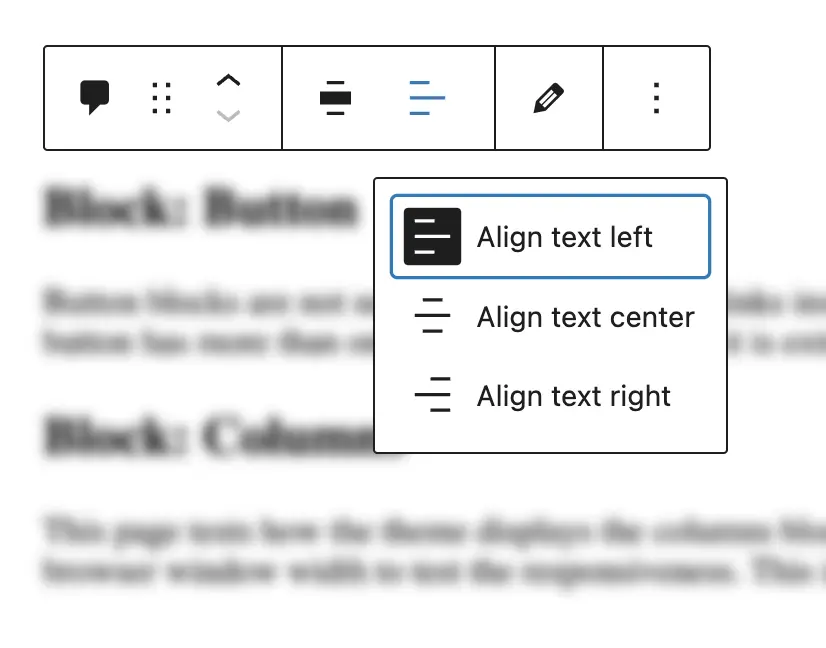
Text Alignment

Enable the text alignment control in your block’s block.json:
{
    "name": "posts-loop",
    "title": "Posts Loop Block",
    ...
    "supports": {
        ...
        "alignText": true
    }
}
Again, in your block’s controller you can apply the appropriate text alignment classnames:
// Block text alignment
if( !empty($block['alignText']) ) {
    $class_name .= ' has-text-align-' . $block['alignText'];
}
The classnames generated would be:
.has-text-align-left {
    text-align: left;
}

.has-text-align-center {
    text-align: center;
}

.has-text-align-right {
    text-align: right;
}
Full height + content alignment
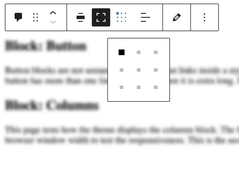
Enable the full height control to create engaging content that stretches 100% of the browser’s height with fullHeight.
You can control the vertical alignment of the inner content with alignContent: true and gain even more control with alignContent: 'matrix'. The matrix setting allows you to align your content to a quadrant of a 3x3 grid.
{
    "name": "posts-loop",
    "title": "Posts Loop Block",
    ...
    "supports": {
        ...
        "fullHeight": true,
        "alignContent": true or "matrix"
    }
}
From a CSS perspective, how you generate class names and apply the CSS is really up to you. It may be a good idea to investigate how the block editor handles styling a block in a certain way and then following the same pattern, but it really is up to you.
For example, the value for the full height control is a boolean (true or false). We can access it in our controller with $block['fullHeight']. Maybe we create a class name called .is-full-height and apply CSS like this:
if ( ! empty( $block['fullHeight'] ) ) {
	$class_name .= ' is-full-height';
}
.is-full-height {
min-height: 100vh;
}Or maybe within our controller we write that style inline to our $styles variable like this:
$styles = "";

if ( ! empty( $block['fullHeight'] ) ) {
	$styles .= ' min-height: 100vh;';
}
The alignment values are found in $block['alignContent']. If you choose true for alignContent in your block.json, you’ll get one of three values back: top, middle, or bottom.
Just like the examples before, you can construct your own class names and apply the appropriate CSS.
If you choose matrix for alignContent in your block.json, you’ll get one of nine values back representing the y and x axis. In general, to handle the alignment class names, the logic in your controller might look something like this:
if ($block['supports']['alignContent'] == 'matrix') {
	// If matrix
	// Replace spaces: center left becomes center-left
	$class_name = ' has-custom-content-position  is-position-' . str_replace(" ", "-", $block['alignContent']);
} else {
	// If not matrix, get the alignContent
	// either top, center, or bottom
	$class_name = ' is-vertically-aligned-' . $block['alignContent'];
}- First we check if the
alignContentis a matrix or not. - If it’s a matrix, we build the class names. I’m following the block editor’s pattern here.
- If it’s not matrix, it’s a vertical alignment. Again, following the block editor’s class name pattern.
I won’t go into writing all of the CSS for these options, but if you’re styling a block using the matrix, you might have something like:
.has-custom-content-position {
    display: flex;
}

.is-position-top-right {
    align-items: flex-start;
    justify-content: flex-end;
}

.is-position-bottom-right {
    align-items: flex-end;
    justify-content: flex-end;
}

// additional matrix class names
If it’s a vertical alignment:
.is-vertically-aligned-top {
    align-self: start;
}
.is-vertically-aligned-center {
    align-self: center;
}
.is-vertically-aligned-bottom {
    align-self: end;
}
Spacing
Achieve a bit more design flexibility with spacing controls and apply margin and padding to your ACF block.
{
    "name": "posts-loop",
    "title": "Posts Loop Block",
    ...
    "supports": {
        ...
        "spacing": {
            "margin": [
                "top",
                "bottom"
            ],
            "padding": true
        }
    }
}
For both margin and padding, you can specify where an editor can apply values (top, right, bottom, left) or simply just set it to true.
To access your spacing values in your template, you might want to create a helper function. Otherwise, things get a bit verbose and repetitive. In functions.php or template-functions.php, we’ll create a helper function that accepts one parameter, our blocks styles:
if ( ! function_exists( 'get_block_styles' ) ) :
    function get_block_styles($attributes) {
        $styles = "";

        // Get our top, right, bottom, and left padding values
        if ( ! empty( $attributes['spacing']['padding'] ) ) {
            $paddingTop = $attributes['spacing']['padding']['top'] ? "padding-top: {$attributes['spacing']['padding']['top']};" : '';
            $paddingRight = $attributes['spacing']['padding']['right'] ? "padding-right: {$attributes['spacing']['padding']['right']};" : '';
            $paddingBottom = $attributes['spacing']['padding']['bottom'] ? "padding-bottom: {$attributes['spacing']['padding']['bottom']};" : '';
            $paddingLeft = $attributes['spacing']['padding']['left'] ? "padding-left: {$attributes['spacing']['padding']['left']};" : '';
            $styles .= "{$paddingTop}{$paddingRight}{$paddingBottom}{$paddingLeft}";
        }

        // Get our top, right, bottom, and left margin values
        if ( ! empty( $attributes['spacing']['margin'] ) ) {
            $marginTop = $attributes['spacing']['margin']['top'] ? "margin-top: {$attributes['spacing']['margin']['top']};" : '';
            $marginRight = $attributes['spacing']['margin']['right'] ? "margin-right: {$attributes['spacing']['margin']['right']};" : '';
            $marginBottom = $attributes['spacing']['margin']['bottom'] ? "margin-bottom: {$attributes['spacing']['margin']['bottom']};" : '';
            $marginLeft = $attributes['spacing']['margin']['left'] ? "margin-left: {$attributes['spacing']['margin']['left']};" : '';
            $styles .= "{$marginTop}{$marginRight}{$marginBottom}{$marginLeft}";
        }

        return $styles;
    }
endif;
Back in our block’s controller:
<?php
    $styles = get_block_styles($block['style']);
?>
And in our render template:
<?php $styles = $args['styles']; ?>

<div
    style="<php echo $styles; ?>"
    id="<?php echo $block_id; ?>"
    class="<?php echo $class_name; ?>">
    ...
</div>
Color Picker
By far my favorite control is the Core color picker. You can enable the color picker for the background of your block, the text color for its contents, and (for some reason) the color of links in your content.
{
    "name": "posts-loop",
    "title": "Posts Loop Block",
    ...
    "supports": {
        ...
        "color": {
            "background": true,
            "text": true,
            "link": false
        }
    }
}
Gutenberg generates a few classes for Core blocks with colors applied. If a Core block has a background class applied you’ll get:
<div class="has-background has-{color_slug}-background-color">
    ...
</div>
If you apply text color you’ll get:
<div class="has-text-color has-{color_slug}-color">
    ...
</div>
Let’s bring these classes into your block’s controller:
<?php
    // Set the background color classnames
    if ( ! empty( $block['backgroundColor'] ) ) {
        $class_name .= ' has-background';
        $class_name .= ' has-' . $block['backgroundColor'] . '-background-color';
    }

    // Set the text color classnames
    if ( ! empty( $block['textColor'] ) ) {
        $class_name .= ' has-text-color';
        $class_name .= ' has-' . $block['textColor'] . '-color';
    }
?>
The classnames has-background and has-text-color are really handy. There are times where you may want to globally apply styles to blocks that have a background color. One example might be group blocks. If a group block has a background color you can pretty much guarantee you’ll want to apply padding. Otherwise the group’s contents will sit on the edge of the background.
Other controls
This isn’t a full list of the controls available in the block API. Dig around in the Block Editor Handbook and you’ll discover other controls and capabilities to bring into your block.
🤜 🤛 You did it!
If you've followed along, let me know how this went or if you have any questions.
@Joey_Farruggio or joey@joeyfarruggio.com